Click to Call
Mobile Billboard Artwork Specifications Guide
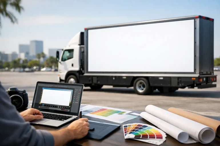
A mobile billboard can reach a busy shopping strip at lunch, a stadium precinct before kick-off and a commuter corridor during peak hour. But that visibility only works when the creative is built for movement, distance and real street conditions. Mobile billboard artwork specifications are not a final production detail. They determine whether your message is seen, understood and remembered in the few seconds a vehicle has an audience’s attention.
A strong outdoor design does not need to say everything. It needs to say the right thing at a glance. Start with the format, confirm the production template and build artwork that does its job from the kerb, not just on a designer’s screen.
Start With the Correct Mobile Billboard Artwork Specifications
Every mobile format has its own display area, panel layout, safe zones and production requirements. A conventional mobile billboard has a different canvas to a digital mobile billboard, solar ad trailer, bike board, walking board or event screen. The artwork cannot simply be resized from a social post, print ad or website banner and expected to perform.
Request the current artwork template for your booked format before creative begins. That template should guide the finished size, bleed, trim area, safe area, file type, colour settings and delivery deadline. It also shows where practical constraints sit, including joins, frames, wheel arches, access doors, lighting, structural edges or hardware that may affect the visible message.
Keep essential copy, logos, phone numbers and calls to action inside the supplied safe area. Bleed exists for background colours and images that need to run beyond the finished edge. If a face, product pack or line of copy is pushed into the trim area, it may be cut off or lose impact once installed.
For printed displays, supply high-resolution artwork at the scale specified in the template. Larger outdoor artwork does not always require the same resolution as a brochure, but low-quality source images will still look soft, pixelated or unprofessional at close range. For digital units, use the supplied pixel dimensions and file settings rather than relying on a generic screen export.
Build for the physical display, not the mock-up
A desktop mock-up is useful, but it is not the street. On the road, viewers see a mobile billboard at changing distances, angles and speeds. Sunlight can flatten weak contrast. Reflections can affect digital screens. A vehicle may pause at lights, then move through traffic. Your design has to remain clear through all of it.
Check a scaled proof before approval. Ask one simple question: can a person identify the brand, understand the offer and know what to do next without leaning in? If the answer is no, simplify it.
Design for Fast Recognition
Mobile outdoor advertising earns attention quickly. That makes hierarchy more valuable than detail. Give the viewer one dominant message, one brand cue and one clear action. Campaigns often lose effectiveness when a perfectly good offer is buried under too much copy.
Aim for a bold headline that can be read at a distance, supported by a short secondary line only if it adds genuine value. A large logo, recognisable product image or distinctive brand colour can do more work than paragraphs of explanation. If your campaign needs eligibility details, terms or legal information, make sure it remains compliant, but do not let fine print become the creative centrepiece.
A useful street-level structure is simple: lead with the offer or proposition, make the brand unmistakable, then show the action. For example, a venue promotion may lead with the artist or event date, a property campaign may lead with the location and release message, and a retail campaign may lead with the sale. The answer depends on what matters most to the person seeing it in transit.
Use contrast that survives daylight
Outdoor colour choices should be deliberate. Pale lettering over a light image, thin type over a detailed photo, or a low-contrast brand palette may look refined in a presentation but disappear on the street. Create strong separation between text and background using contrast, solid panels, outlines or controlled image treatment.
Do not rely on colour alone to communicate meaning. This matters for accessibility, but it also matters when the artwork is viewed in harsh sun, shade, rain or at speed. Use clear words and visual hierarchy alongside colour.
Black, white and bold brand colours can work extremely well when they are used with purpose. The goal is not to make every artwork loud. It is to make the important element impossible to miss.
Choose Images That Carry Their Weight
One excellent image is usually stronger than a collage. Select visuals with a clear focal point, clean composition and enough empty space for your message. Product photography, a recognisable face, a striking location or a simple graphic can all perform well when the subject remains obvious from several metres away.
Avoid images that are dark, heavily compressed or crowded with small details. Backgrounds filled with texture, tiny products or busy interiors compete with copy. If the image is essential, crop it with confidence and allow the focal subject room to breathe.
Be careful with photographs that place important features near panel edges, joins or vehicle hardware. A model’s face or a product label may be the campaign’s strongest asset, so it should not sit where the physical format can interrupt it. The supplied template should always take priority over assumptions made from a flat layout.
Printed and Digital Artwork Need Different Thinking
Printed mobile billboard artwork is produced as a physical graphic. It needs appropriate bleed, safe zones, high-quality imagery and a colour approach suited to print output. Colours can vary between a backlit screen and printed vinyl, particularly fluorescent shades, metallic effects and very subtle gradients. Where exact brand colour is critical, provide approved colour references and allow for a production proofing conversation.
Digital mobile billboard artwork is displayed on an LED screen, which changes the creative rules. Use the specified pixel dimensions, avoid very fine lines and ensure text is large enough to read cleanly. Motion can be powerful, but it should support the message rather than turn it into a visual puzzle.
Keep digital animation short and purposeful. A viewer may only catch part of the loop while passing the screen. Put the brand and main message early, hold key frames long enough to be read, and avoid rapid transitions, flashing effects or tiny moving text. A static frame with strong contrast can outperform a complicated animation when traffic is moving quickly.
If your campaign runs across both printed and digital formats, do not force identical files into every placement. Maintain the same campaign idea, colour world and message hierarchy, then adapt the execution to each display. That is how a multi-format campaign looks consistent without looking compromised.
Plan the Message Around Location and Audience
A mobile billboard gives you the advantage of taking creative where people are already gathering. Use that flexibility. A campaign circling a retail precinct can be more immediate than one travelling near a sports venue, university, festival or business district. The creative should reflect the audience, route and time of day.
Location-led messaging can work particularly well when it remains clear and relevant. A short suburb reference, event call-out, opening announcement or time-sensitive offer can create urgency. However, do not over-localise artwork if the same vehicle will cover several areas. In that case, a broader message may deliver better value and keep production simpler.
QR codes need special care. They can be useful when the billboard is stationary, parked near a venue or displayed in a queue environment. They are less reliable on a moving vehicle because people need time, proximity and a safe opportunity to scan. If you use one, make it large, isolated and backed by a clear reason to scan. Always include an easy-to-remember website, offer code or brand search term as another path to action.
Complete a Proper Pre-Flight Check
Before artwork goes to production, review the final file against the approved template, not just the original design brief. Confirm the campaign dates, format, correct panel version and any state-specific requirements. Check spelling, dates, prices, contact details, legal copy and logo versions with fresh eyes.
Your final pre-flight should confirm that all essential elements sit within safe areas, images are fit for output, fonts are correctly handled, colours are prepared for the chosen medium and files meet the required naming and delivery standards. For digital creative, also check duration, frame sequence and readability of the full loop.
Allow enough lead time for revisions and production. Fast turnaround is possible, but late creative decisions can reduce your options, particularly where printing, installation or a national rollout is involved. A clear approval process protects campaign timing and avoids preventable reprints.
Mobile Outdoor Media can provide format-specific templates and production support so your artwork is prepared for the display you have booked, whether the campaign is targeting one city or rolling out nationally. Get the practical details confirmed early, then let the creative work hard where it counts: out on the streets, in front of real audiences.
Related reading: How to Prepare LED Screen Creative That Gets Seen
Artwork sorted and ready to book? Book your run.