Click to Call


Your Guide to Daylight Screen Visibility
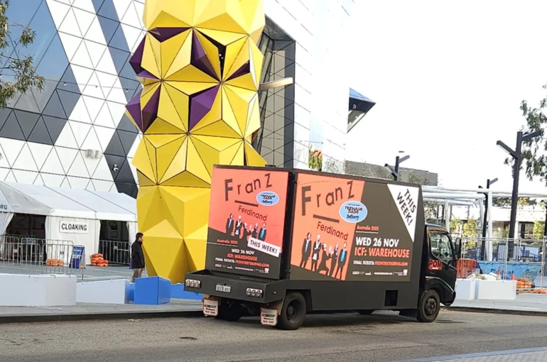
A digital screen can look exceptional in a controlled showroom and disappear the moment it hits a bright Brisbane street or an exposed event precinct. This guide to daylight screen visibility is built for campaign managers who need more than a good-looking file – they need a message people can see, read and remember in real outdoor conditions.
Daylight visibility is not one specification on a quote. It is the result of screen brightness, ambient light, artwork, viewing distance, screen position and the route or site around it. Get those working together and your mobile billboard or event screen earns attention from morning through to late afternoon.
A guide to daylight screen visibility for outdoor campaigns
Outdoor digital advertising competes with direct sunlight, reflective glass, pale concrete, headlights, traffic movement and every other visual distraction in the street. A screen must create enough contrast to stand apart without blasting the image into a washed-out block of colour.
Brightness is usually measured in nits. Higher output generally gives an LED screen a stronger chance against daylight, particularly in open areas with harsh sun. But brightness alone does not guarantee a visible campaign. A very bright screen displaying low-contrast artwork can still be hard to read. Equally, pushing brightness harder than needed can affect power use, heat management and viewer comfort as daylight fades.
For mobile and event applications, use outdoor-rated digital displays designed to adjust to changing ambient light. Automatic brightness control helps the screen respond as conditions move from a shaded street to full sun, then into dusk. It protects legibility across the day and gives the creative a more consistent appearance.
Start with the actual viewing environment
The best screen choice depends on where the audience will see it. A mobile digital billboard travelling through retail strips, commuter corridors and busy precincts faces a constantly changing light environment. An Event Screen 16 positioned beside an open sports field may face direct sunlight for hours. A screen within a covered venue entry has a different job again.
Before booking a format, consider the campaign’s likely exposure conditions. Ask whether the audience will be viewing from vehicles, on footpaths, in queue lines or across a large event space. Identify the direction the screen will face at key operating times. A west-facing screen can face intense afternoon glare, while a location with nearby buildings may shift quickly between shadow and sun.
This is where mobile media has a practical advantage. If a route, trading area or event activation is not delivering the right audience conditions, the campaign can move. Static sites cannot change position when foot traffic shifts or a sightline is blocked.
Build artwork for contrast, not just brand guidelines
Your brand colours matter, but outdoor creative needs to work at speed and distance. Fine print, subtle gradients and low-contrast colour combinations may look refined on a laptop yet lose impact in full daylight.
Start with a clear contrast between the background and the main message. Dark text on a light background, or light text on a dark background, usually gives viewers the fastest read. The exact treatment depends on the colours, screen calibration and time of day, but the goal stays the same: make the essential message immediately distinct.
Use one focal point. That may be a product, offer, event date or short call to action. When a screen is viewed from a moving vehicle, the audience does not have time to scan a catalogue of benefits. Give them the campaign idea first, then support it with only the information required to act.
Avoid relying on thin fonts, narrow typefaces, pale text over photography or intricate logos at small scale. A logo is useful for recognition, but it should not do all the communication work. If someone sees the screen for three seconds, they should understand what is being promoted before they process the brand mark.
For photos and video, select images with a defined subject and enough separation from the background. Busy scenes become visual noise outdoors. If text must sit over an image, use a solid colour panel, a strong overlay or a carefully chosen area of negative space. That small design decision can make the difference between a striking screen and an unreadable one.
Keep the message moving at the audience’s pace
Animation can attract attention, but excessive movement can weaken daylight readability. Fast transitions, flashing elements and multiple scene changes force people to work harder to find the message. They may notice the motion without remembering the advertiser.
Use movement to direct attention towards the key offer or visual. Hold the core message on screen long enough for a passer-by to read it. For vehicle audiences, that often means treating each frame like a billboard first and a video second. Event audiences may have longer dwell time, allowing more storytelling, but the opening frame still needs to land quickly.
Match screen size and pixel pitch to viewing distance
Screen size creates presence, but pixel pitch affects clarity. Pixel pitch is the distance between LED pixels. A finer pitch can provide a cleaner image at closer range, while a larger pitch may suit screens viewed from further away. It is not simply a case of choosing the smallest number available.
For a mobile billboard seen across multiple traffic lanes, the key question is whether text and imagery remain clear at typical viewing distances. For an event screen near food stalls, registration areas or spectator seating, people may stand much closer and expect sharper detail. The screen format, audience position and creative all need to match.
Do not design artwork based only on the pixels of a desktop monitor. Supply artwork to the correct screen specification and review it in its intended format where possible. A production team can help scale layouts, test type size and flag details likely to vanish outdoors.
Put the screen where it can be seen
A bright screen cannot overcome a poor sightline. Parked vehicles, bus shelters, trees, street furniture, temporary event structures and turning traffic can all interrupt visibility. Positioning is a media decision, not merely an operational detail.
For mobile billboard campaigns, build routes around audience concentration and repeat exposure. Target precincts where people are slowing down, walking between destinations or waiting at key points, rather than simply chasing the busiest road. Gridlocked traffic may provide long viewing time, but only if the screen is visible from the relevant lanes and the message is concise enough to absorb safely.
At events, place screens near natural dwell zones such as entrances, queues, hospitality areas, fan zones and main pedestrian routes. Check whether the sun will sit behind the screen, in front of it or directly across the audience’s line of sight. A small adjustment in angle or placement can improve clarity substantially.
Plan for the Australian light cycle
Australian daylight can be uncompromising, particularly in summer and in open urban areas. Campaign planning should account for the hours when sunlight is strongest, not just the total hours a screen is active.
If the campaign runs all day, make sure the creative is tested for high-light conditions. If a promotion is most relevant in the afternoon, prioritise routes and placements that maintain clear viewing in the western sun. For an evening event, plan artwork that can transition from daylight legibility to an effective night-time presence without becoming uncomfortably bright.
Weather also changes the equation. Overcast conditions reduce direct glare but can make low-contrast artwork look flat. Rain can create reflections on roads and surrounding surfaces. Heat can place extra demands on outdoor equipment. The right screen operator manages the technical side, while the campaign team ensures the message is still strong when conditions are less than perfect.
Test the campaign before it takes to the streets
A final proof on a computer is not a daylight visibility test. Request a practical review of the artwork against the selected screen format. Look closely at headline size, legal lines, logo placement, image crop and the contrast of any call to action.
If the campaign is high stakes, create alternate versions. A simple high-contrast version may outperform a more detailed execution during the brightest parts of the day. Different creative can also be scheduled for different environments, such as a short offer-led message for commuter routes and a more informative sequence for event audiences.
Mobile Outdoor Media can coordinate the screen format, placement approach and artwork requirements as one campaign plan, helping brands avoid the costly gap between approved creative and real-world visibility.
Treat daylight as part of your media plan, not a problem to fix after launch. Put a clear message on the right outdoor screen, take it to the right audience and give every passing glance a reason to stop.